A Visual Navigation of the
Data Analysis, Data Science
& Machine Learning
Job Markets
Introduction
Undeniably, professions in the tech industry makeup a large segment of the U.S.
job market. Net technology employment accounts for 7.9% of the total U.S.
workforce [1]. Furthermore, the technology industry's growth rate has
significantly increased since the COVID-19 pandemic. For example, 2019
saw a growth rate of technology jobs of 0.1%, while the most recent figure
has jumped to 2% [2]. That is a 1900% increase!
Considering the numerous job opportunities within the tech industry
and their growth potential, positions that might be of particular interest
to students in Georgetown's Master of Data Science program include, but are not limited to:
- Data Analysis
- Data Science
- Machine Learning
The Bureau of Labor Statistics predicts 23%, 36%, and 21% in employment growth
rate for 2021-2031 in these fields, respectively. But it is important to first,
specifically define the function of each field.
Often, family and friends ask me, "What are the responsibilities of a data scientist?" Even
job postings can be confusing when descriptions of these positions seem so overlapping.
Thus, this project provides an opportunity to dive deeper into the technology job market
by visually analyzing web crawling results for data analysis, data science, and machine
learning roles posted by companies looking to hire.
[1][2] Zippia. "25 Trending Tech Industry Statistics [2023]: Tech Industry Demographics,
Worth And More" Zippia.com. Mar. 6, 2023, https://www.zippia.com/advice/tech-industry-statistics/
Visualization Gallery
This gallery displays various portions of figures used to analyze web crawling
results for data analysis,
data science and machine learning roles.
Hover and click to learn more about each image.
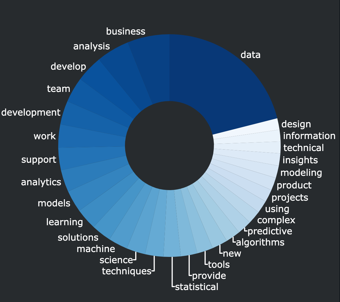
1. Job Type Responsibilities
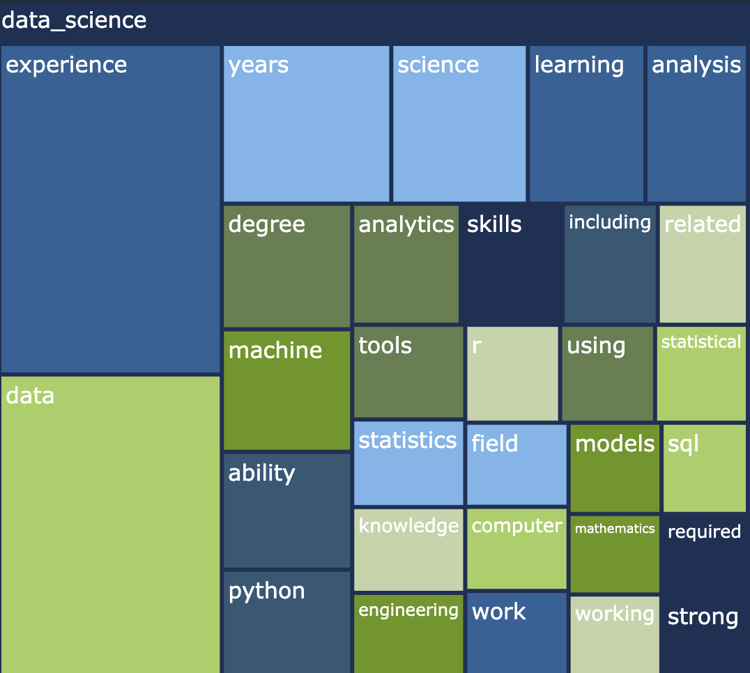
2. Job Type Qualifications
3. Job Type Remote Status
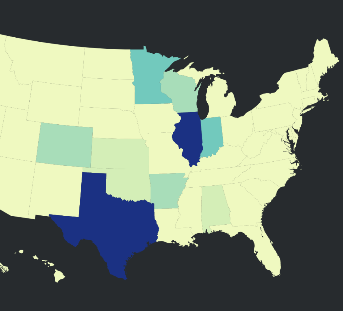
4. Job Type Location Analysis
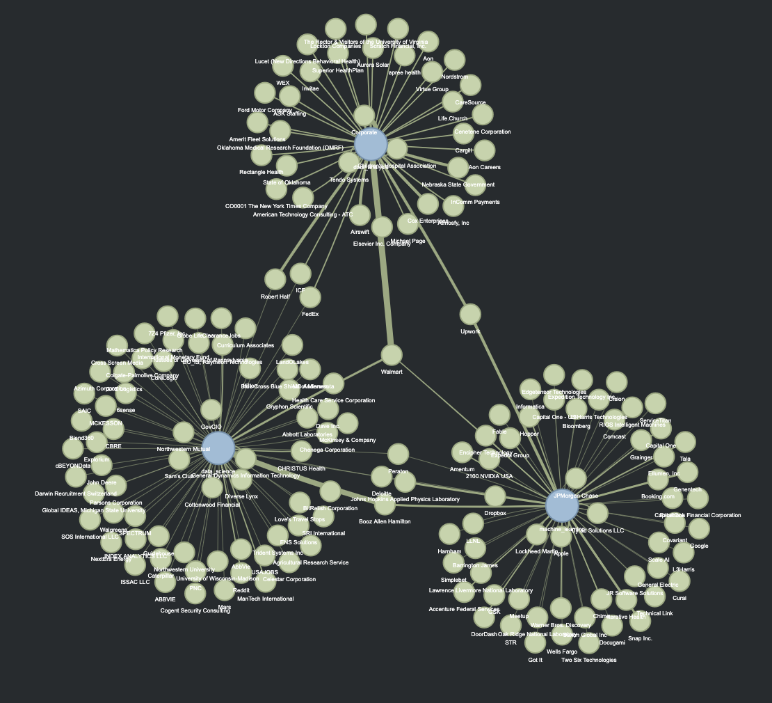
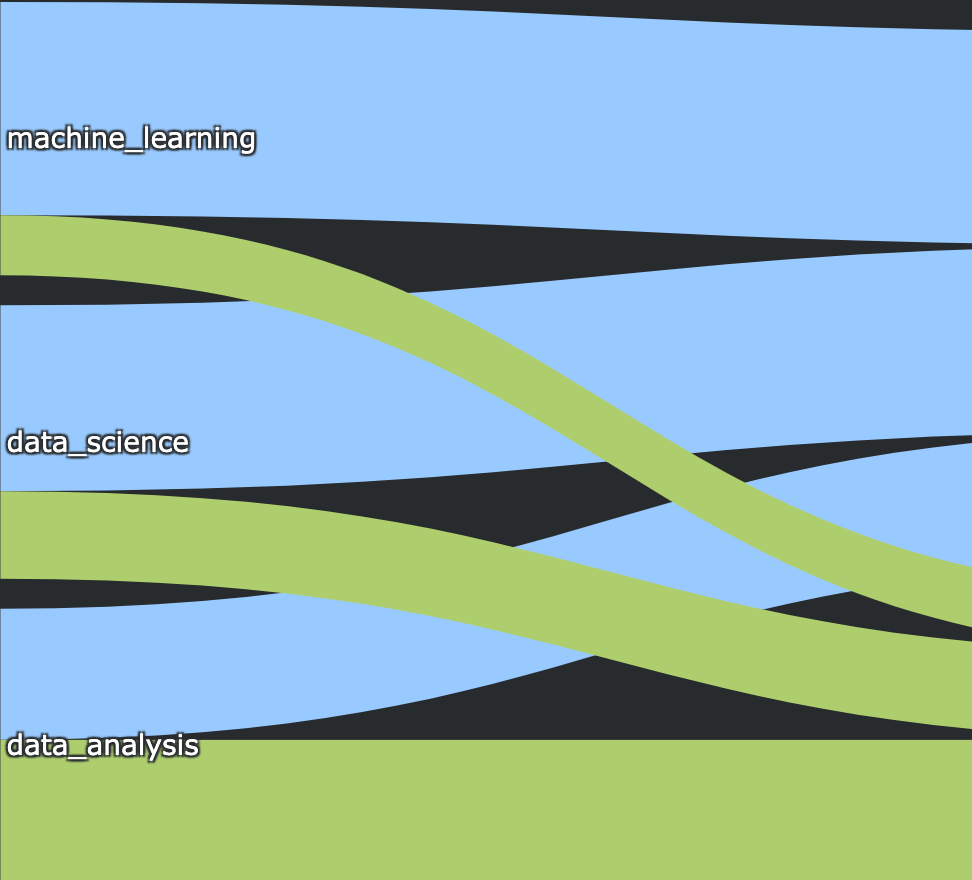
5. Job Type & Company Network

6. Job Type Schedule Appointment
7. Job Type Salary Distribution
Conclusion & Future Exploration
The visual journey on the outlook of the data analysis, data science, and machine learning job markets
has provided valuable insights into current trends and opportunities in these three technological industries.
The use of donut charts and treemaps provide clear distinctions in keywords that describe the
responsibilities and qualifications of these roles, highlighting statistics and machine learning algorithms
for data science, so thank you to ANLY511 and ANLY501. Using sankey diagrams and choropleth maps
help identify location trends for these roles. While most job roles are not remote and are
relatively split evenly between the coasts and the midwest, it can vary by industry as we saw machine learning
roles specifically have more non-remote jobs, and data analysis/data science roles are heavily located
in the midwest. The network graph provides insight into the companies with open positions for all
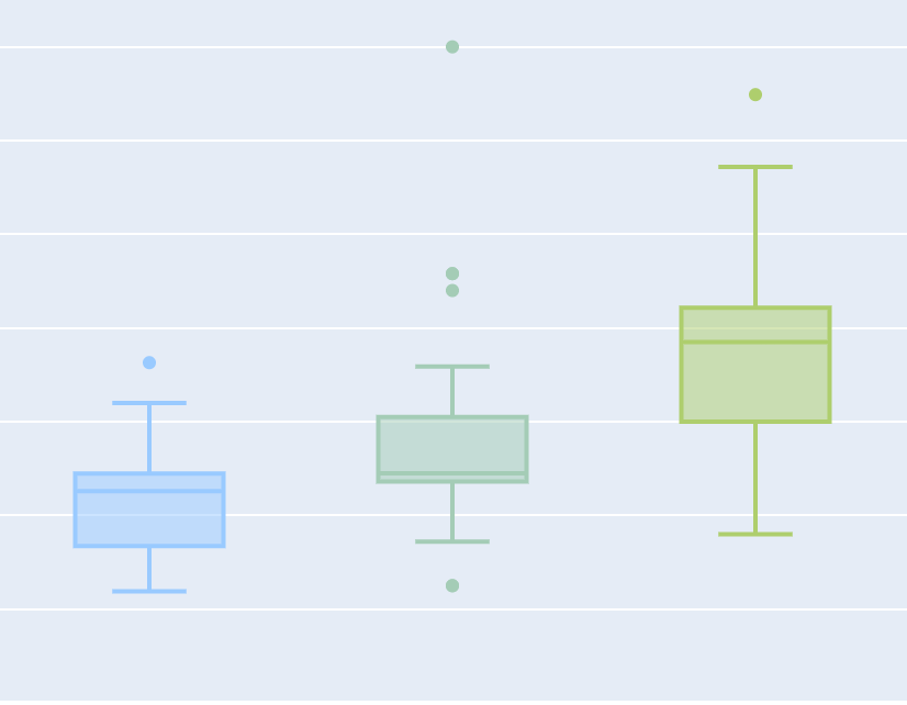
three job types, while others may only be looking for a specific one. Finally, the heatmap and boxplot
display that most open roles are full-time only, and compensation for those full-time opportunities
can vary by job type, even when comparing results from all over the US, and the DC area specifically.
Future work on this analysis involves three steps. One challenge encountered through this process
was the small sample size of data because of the angle taken to analyze data analysis, data science,
and machine learning specifically. Therefore, the first would be to expand the dataset to include at least
100 (ideally 500) query results for each of the three roles isolated in this project. The second step would
be to research further how to add filters to each figure to create even more
informative visualizations. For instance, add an additional layer to the network graph so a user can
filter by location and observe any data analysis, data science, and machine learning location and company trends.
The final step involves the creation of a dashboard with similar visualizations that pulls the latest
job search data on a timed cadence and is made public to DSAN students.
Although the DSAN program and Georgetown have excellent career resources, a
current visual dashboard would be a unique addition to our program.